Jack Roberts
Every Level of Claude Code Websites Explained
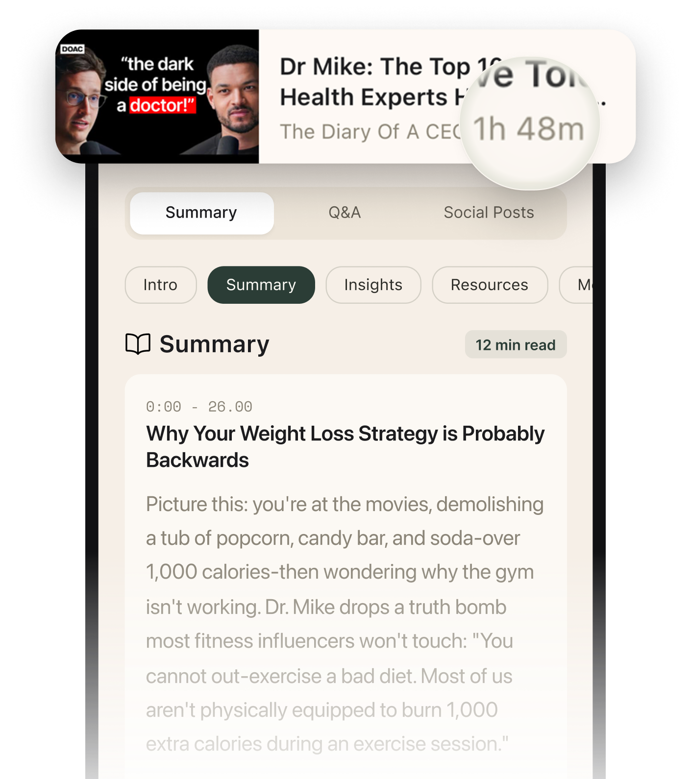
Summarised with Bite · 10 min read
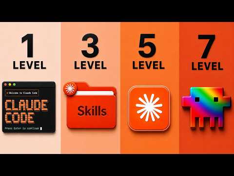
Jack breaks down why most Claude-made websites look like generic AI slop, then shows a seven-level ladder for fixing that. The core idea is simple but powerful: stop treating Claude like a chatbot, start feeding it references, design skills, reusable components, real market data, and finally extracted design blueprints so it can build sites that not only look better, but convert.
0:00 – 8:12
Why Most Claude Websites Fail, and the First Three Levels of Improvement
The video opens with a blunt insult to almost every AI-built site on the internet: "95% of them are complete garbage." Jack immediately softens the blow by saying that this is not the user's fault. His analogy is the memorable part. Giving Claude no design guidance is like having Mozart with no piano. The talent might be there, but the instrument and instruction are missing. He starts with level one, what he calls the "grab and go." This is the most common mistake: opening Claude and typing something like, "build me a nice looking website" and hoping for magic. Jack compares it to hiring an interior designer and saying only, "make the room look nice." The result is predictable. He shows a basic yellow iPhone page with a floating phone and a generic AI aesthetic, and rates this level at roughly "three out of a hundred" for design quality. It technically works, but it has almost no real taste behind it. Level two fixes that by replacing vague instructions with visual references. Instead of telling Claude what "beautiful" means, you show it. Jack pulls examples from sites like Godly, Landbook, Awwwards, and Dribbble, and treats them like a mood board. His point is practical: an image really does "speak a thousand words" when you are trying to steer layout, spacing, and visual direction. The jump is not subtle. He says this takes quality to around "10 out of 100," not because the result is finished, but because Claude is finally responding to concrete evidence instead of guesswork. Then comes level three, and this is where his model of Claude becomes clearer. References help, but they still do not make Claude a designer. So Jack introduces "skills," which he describes as prepackaged instruction sets made by design obsessives. This is his second strong analogy: skills teach Mozart how to play the piano. He shows repositories on GitHub, including a frontend design skill with almost "100,000 stars" and a UI/UX skill packed with "67 UI styles, 161 color palettes, font pairings" and other guidance. The surprising angle here is that better prompting alone is not enough. Claude improves because it is being loaded with design judgment from people who have already codified what works. When he reruns the yellow iPhone site with skills plus a reference image, the result is still imperfect, but noticeably more intentional: cleaner typography, a tighter palette, more Apple-like cues, and a Bento Box layout. It is no longer just a generated page, it is starting to feel designed.
2 more sections in the app
- 8:12 – 14:22Adding New Creative Muscles, Images, Video, and Reusable UI Components
- 14:22 – 21:03Why Beautiful Is Not Enough, Using Market Data and Design Extraction to Reach Level Seven
Summarised by Bite, an AI YouTube video summarizer that also works as a podcast summarizer.